February 6, 2022
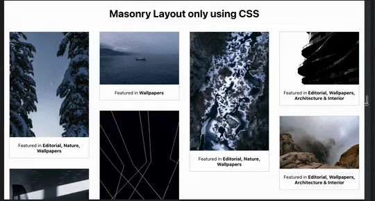
Masonry layout using only CSS
Creating masonry layout using only CSS without any Javascript

Masonry layout is a popular technique that involves arranging items in a staggered grid (e.g., Pinterest). While I was looking to build a masonry layout, I found a couple of solutions that involved using libraries like Masonry & MiniMasonry. These required using Javascript, but I believe most of the layout should be created using CSS with minimal JS code. So in this post, I will highlight how to implement masonry layout using only CSS.
CSS now has a native way to build masonry layouts using CSS Grids. But it is only available behind a flag on Firefox. It will take some time to land in all the browsers. So we will be using this along with column layout as a fallback.
Code
First, let’s create the HTML template.
<div class="container">
	<div class="masonry-item">
		<!-- add elements here  -->
	</div>

	<div class="masonry-item">
		<!-- add elements here  -->
	</div>
</div>
Here we will be applying styles to the container class.
We will be checking if the browser supports particular CSS property using a feature query that uses the at-rule @supports. So we can check if the browser supports grid-template-rows: masonry and load those styles.
.container {
	--masonry-columns: 4;
	--masonry-gap: 1rem;
}

@supports (grid-template-rows: masonry) {
	.container {
		display: grid;
		grid-template-columns: repeat(var(--masonry-columns), 1fr);
		grid-gap: var(--masonry-gap);
		grid-template-rows: masonry;
	}

	.container > * {
		margin-bottom: 0;
	}
}
I’m using CSS custom properties for defining the number of columns and spacing between each masonry cell. It will help us in
- Using the same variables for the main layout and the fallback.
- We can change the custom properties value in the media query for responsive layout.
@media (min-width: 630px) {
	.container {
		--masonry-columns: 2;
		--masonry-gap: 0.5rem;
	}
}
Bamn, now we have 2 column masonry layout on-screen sizes less than 630px.
Since grid-template-rows: masonry won’t work on most browsers, we need an alternate way to create the masonry layout. Here, we will use the CSS column layout as a fallback.
/* fallback */
.container {
	column-count: var(--masonry-columns);
	column-gap: var(--masonry-gap);
}

.container > * {
	margin-bottom: var(--masonry-gap);
	break-inside: avoid;
}
Here’s the link to the codepen to try it out.